
Workel: I tried the dashboard. I think it's a hard sell
A few days ago I wrote about signing up for Workel through a Reddit promo, paying nothing for a year on their Max plan. That post was about the pricing chaos I saw before I ever opened the dashboard. This one is about what happened once I did.
Read also: Workel.com: I signed up through Reddit, and I'm still confused about their pricing
I sent that post to the Workel team. The founder replied, friendly, and said this:
"Our strategy, however, at the moment is to onboard as many free 1-year plan subscribers as possible. We're focusing on product development."

I'd promised a follow-up once I went through the product, because the first time I opened the dashboard I was too overwhelmed to write anything useful about it. I needed a clear head before going through it properly. I finally found one.
Quick disclaimer:
Same as last time: Everything below is my opinion, formed as a user and a builder, not as someone with access to their internal data.
If it reads harsh, that's consistent with how I write about my own decisions too. I criticize myself daily, in public, on this blog. Workel doesn't get special treatment just because the subject this time is someone else's product.
First impressions
My first reaction to the onboarding was that it's overwhelming. I genuinely didn't know where to look. Left, right, center, bottom. There were buttons everywhere and no clear order to any of it.
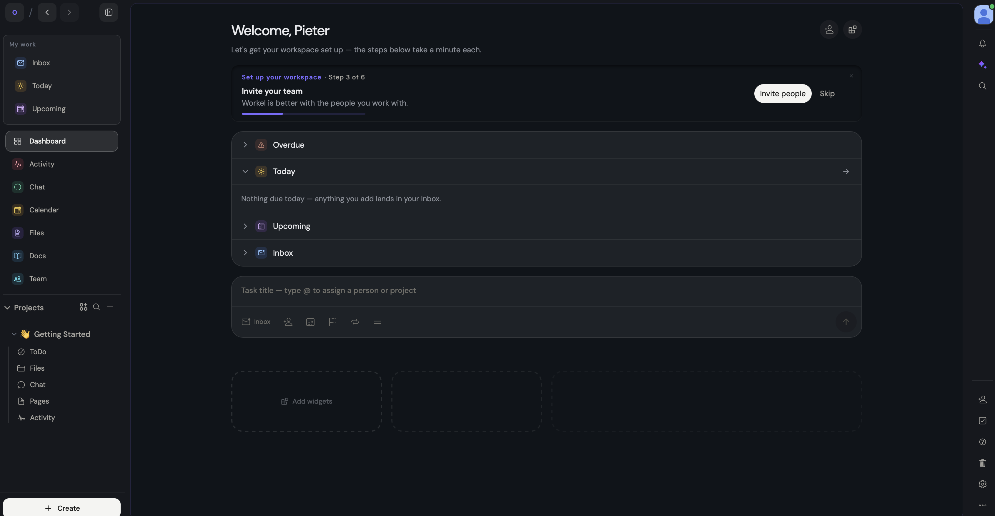
They do have a six-step onboarding flow, but I never followed it properly because I kept getting pulled toward a menu on the right side that didn't seem to follow any logic I could find.
The widget area is a stronger idea than the rest of the layout. Some of the widgets, like workspaces and a world clock, could be useful. But most of what's in there just duplicates the sidebar, which makes me wonder if it needed to exist at all.
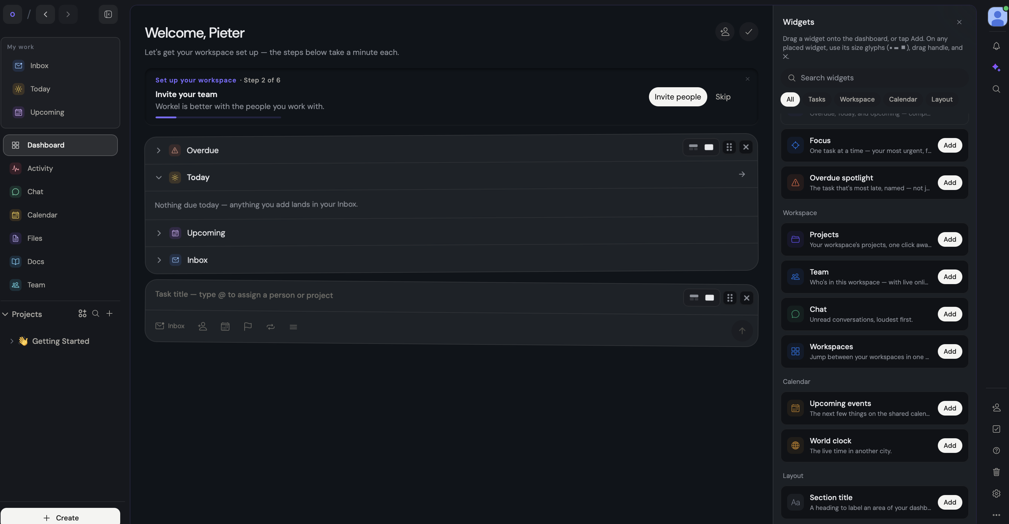
Adding a widget triggers a tilt-and-shake animation, like you're interacting with a phone. I understand what they're going for, but it lands as one more distraction in a screen that already has a dozen calls to action fighting for attention.
Creating a project
I followed the onboarding far enough to create my first project.
The default visibility is Public. I think that's a mistake.
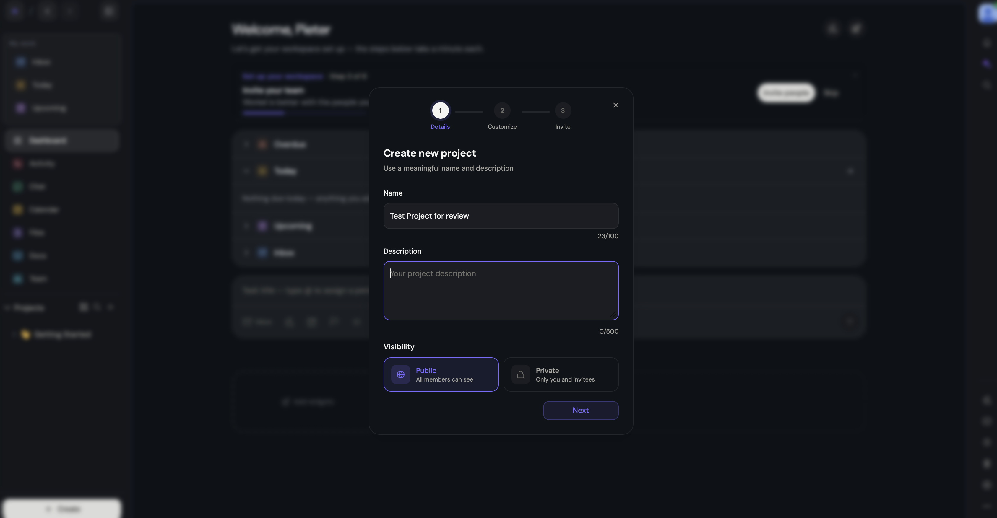
People move fast when they're clicking through setup, and defaults should protect them from their own speed.
Imagine you're at a small company, adding internal notes you assume are private, and it turns out the whole workspace can see them because Public was the default nobody thought to change. I'd flip that default to Private without hesitation.
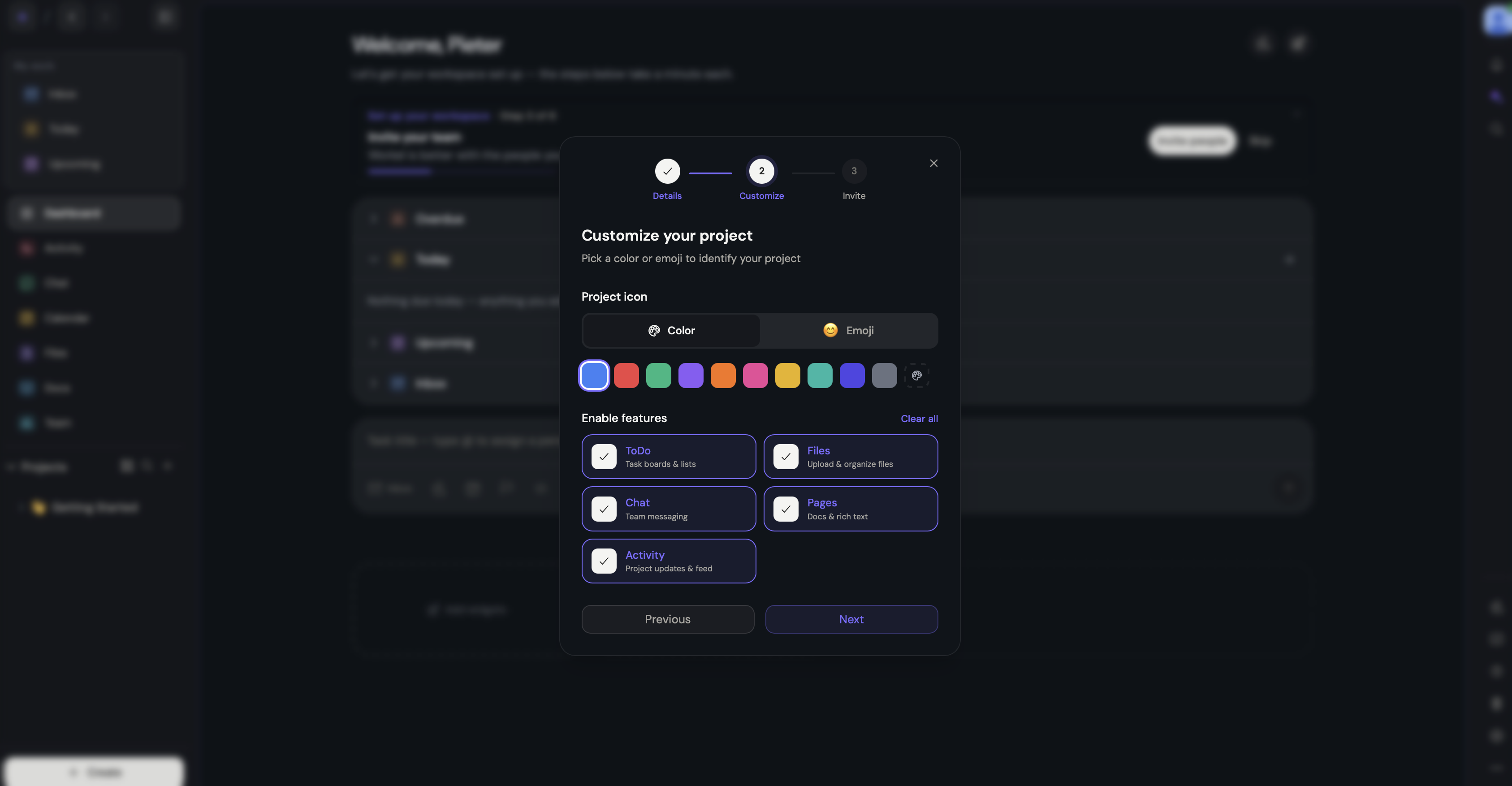
What I do like is that project creation lets you choose which features to turn on. That's probably Workel's strongest idea right now. For the sake of testing it, I turned all of them on.
Confusion, one thing after another
After I created the project, I couldn't tell where I'd landed. Navigation didn't make it clear, and the project I'd just created wasn't even showing up in the Projects sidebar. I refreshed. Still nothing.
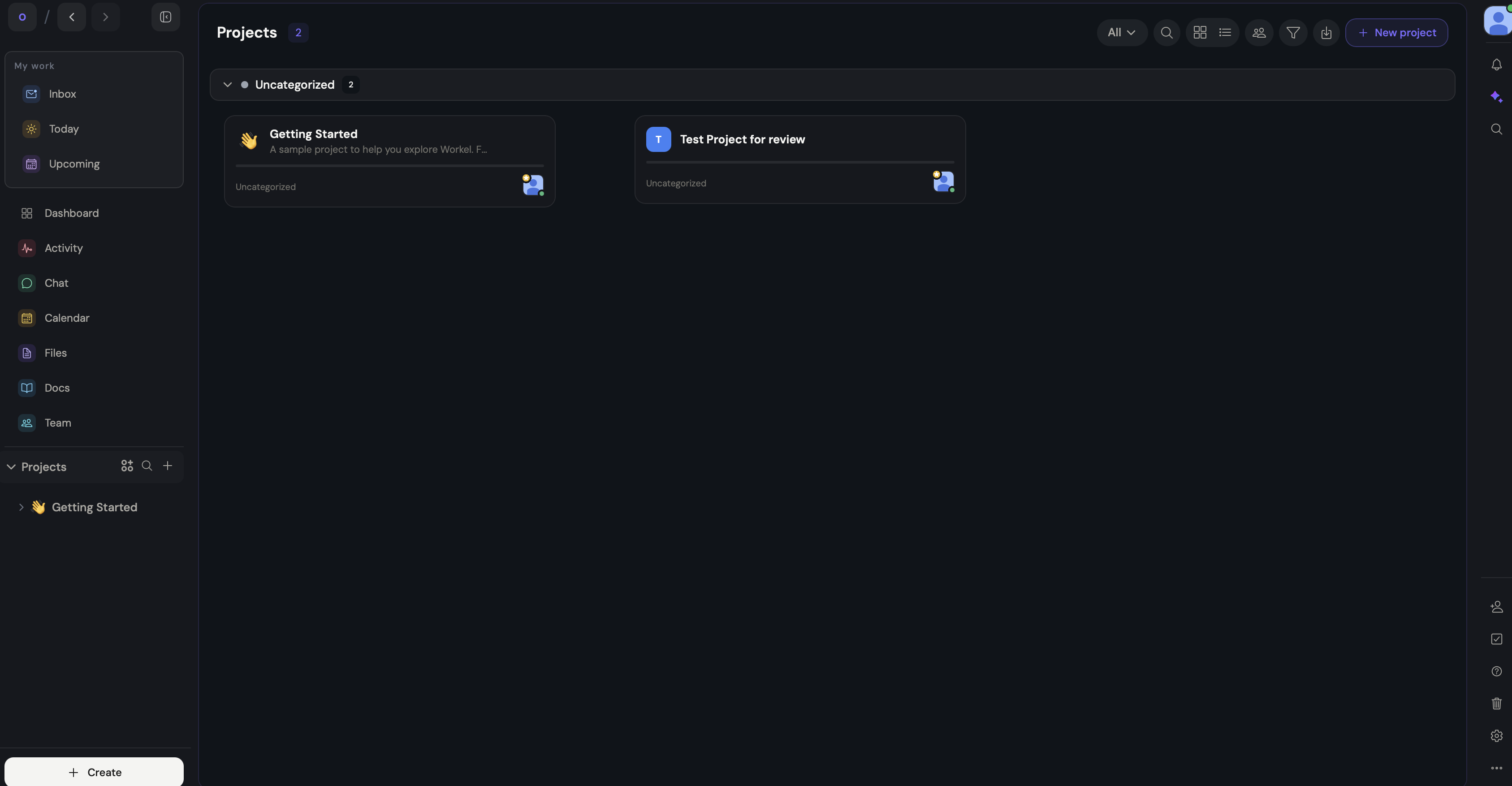
So either the flow is broken, or a newly created project doesn't land anywhere sensible by default, and I'm expected to file it away myself. I genuinely couldn't tell which.
Inside the project itself, the layout isn't bad. Tabs for files, pages, chat, and so on. But those same tabs also exist in the main sidebar, which is supposed to be a unified view of everything.
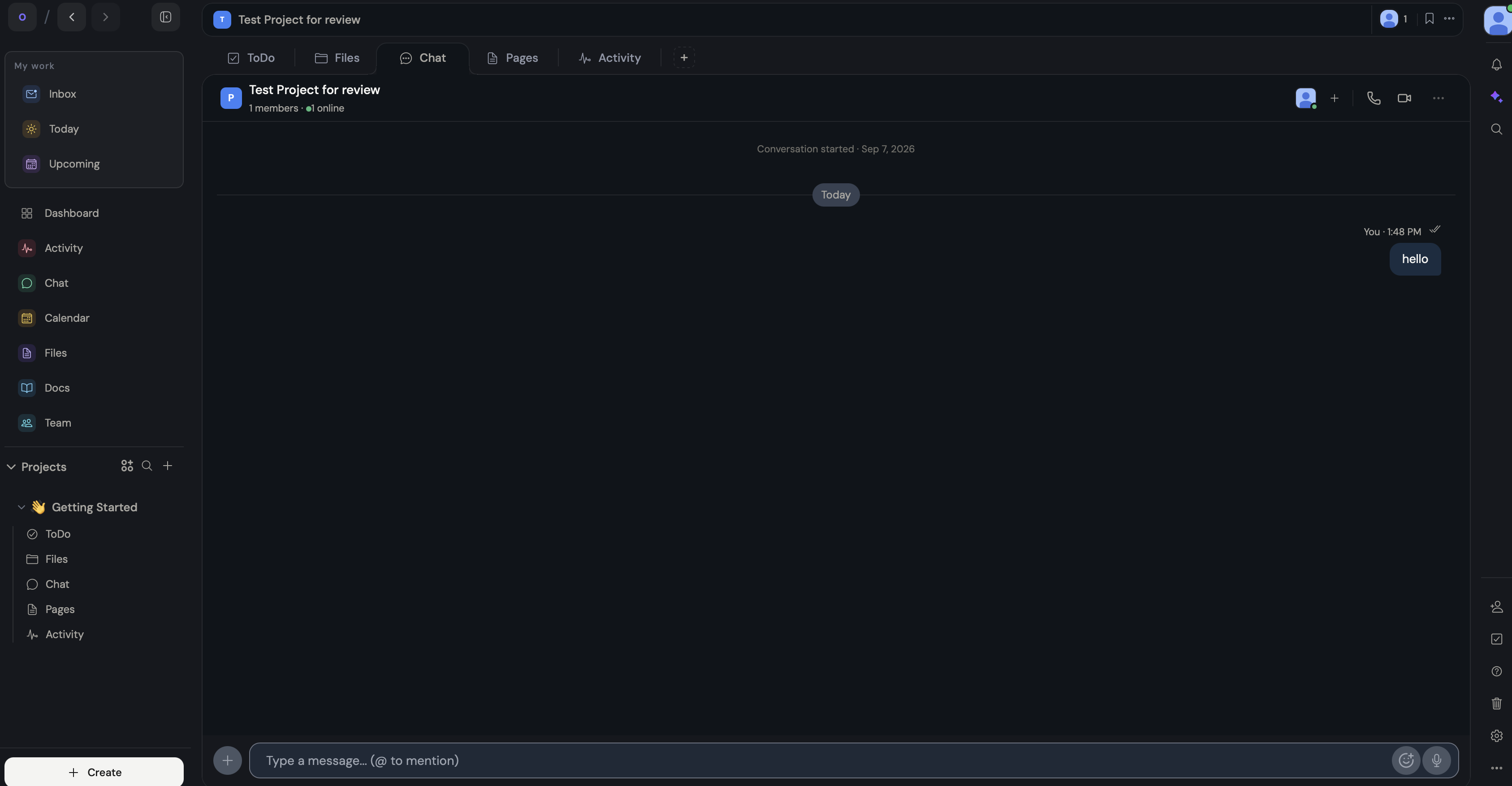
I tested this directly: I typed a chat message inside the project, alone, then checked the main chat bar, and there it was, mixed in with everything else.
That might be efficient in theory. In practice, a unified chatbox is also where human error lives.
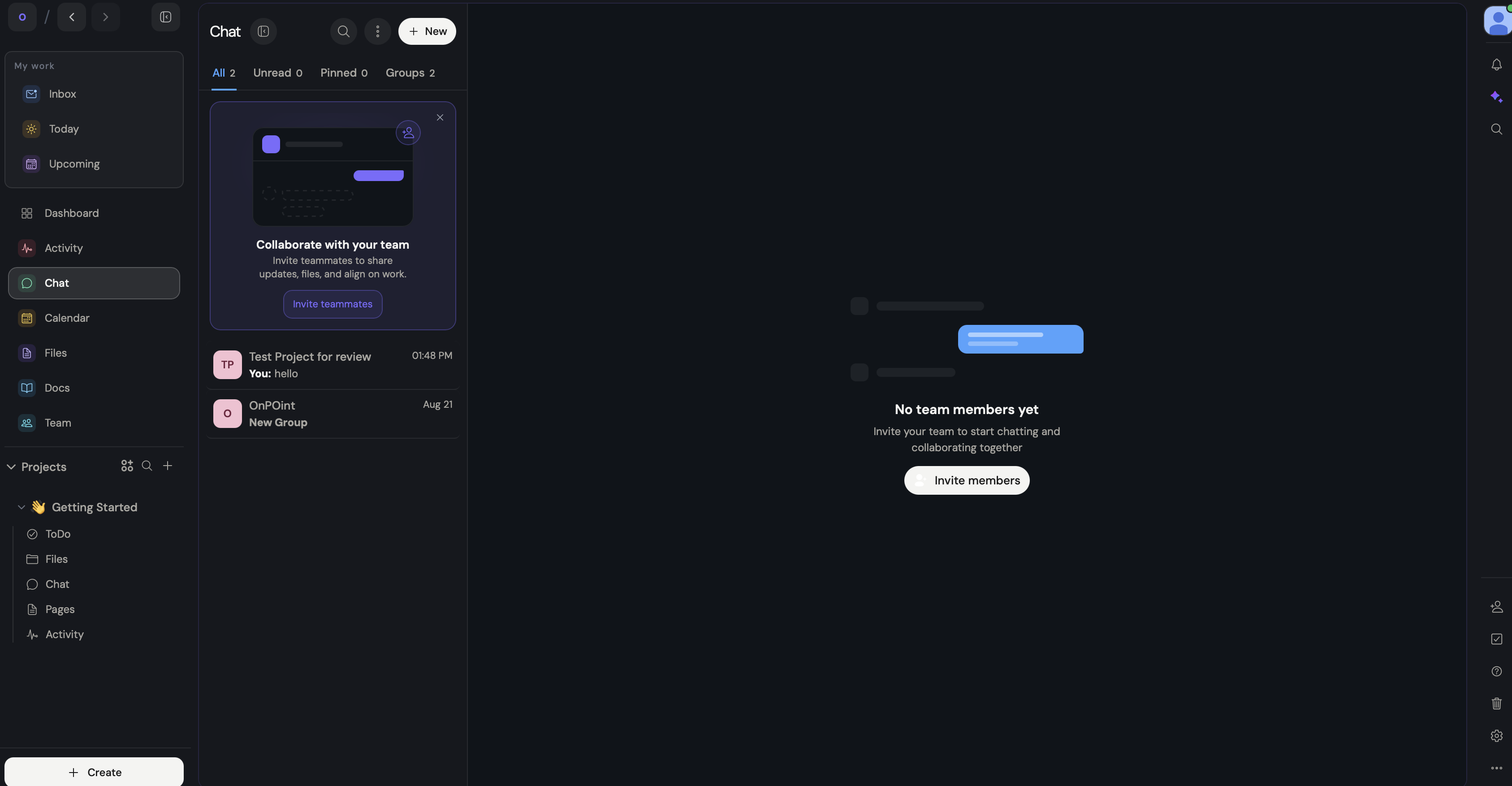
If you're mid-conversation inside a project and send a message, or the wrong file, to the wrong place, there's no separation to catch it. I'd rather see project chats stay inside their project, or at least show up everywhere as read-only, so you're forced back to the right place before you can act on anything.
This might sound like nitpicking. But Workel is positioning itself against tools that are mature, refined, and built for B2B. Details like this are exactly where that comparison falls apart.
I had to stop
At some point I couldn't keep going. Too many calls to action crammed into one dashboard, views scattered everywhere, and the line between groups, projects, and workspaces got so blurry that I lost track of what I was even looking at.
There's a to-do list tucked into the bottom right, an inbox, a today view, an upcoming view, and then to-dos inside each individual project. I had no idea where to look first.
Even clicking into "dashboard" didn't tell me what dashboard was supposed to mean anymore.
They fell into a trap
Going back to that email:
"We're focusing on product development."
I don't know what that means in practice. More bug fixes?
More features stacked on top of an already cramped dashboard? I hope it's not the second one, because that would make the product harder to use, not easier.
I think their biggest mistake, and I've said some version of this before, is trying to do too much at once while ignoring basic UX logic. They seem to believe that more features on top of more features is what productivity looks like.
I recognize the instinct because I've fought it myself. When I was building TWO Docs, I could have added a dozen things I had the ability to build. I chose not to, on purpose, because scope is a decision, not an accident.
Read also: I turned down $8,000 for my domain, and built TWO Docs instead
Workel shipped an MVP that's enormous. When I was learning Swift to build a Mac app from zero, I hit the same wall: the urge to do everything at once. I had to force myself to slow down. I don't think Workel has done that yet.
Read also: How do you vibe code a Mac app? Part 2: decluttering
My biggest fear
Workel might work for solo builders, freelancers, or small teams who want everything in one tab instead of switching between five apps. I don't see the case for B2B adoption yet.
There's too much surface area, and a dashboard that unifies everything is also a bigger target if something goes wrong. Workel doesn't have a track record. It doesn't have the integrations that Monday, Notion, and ClickUp already have. It doesn't have the years of B2B usage data those companies are working from.
My real concern is that they're trying to compete with giants on every front at once, and scope creep is what kills companies that try that.
The same email response that mentioned product development also said they're focused on onboarding as many free year-long subscribers as possible.
That lines up with the Reddit offer I took. It doesn't line up with the five- and six-dollar monthly plans they're A/B testing in ads at the same time. And it really doesn't line up with an "exclusive" Instagram offer that's posted everywhere on their site.
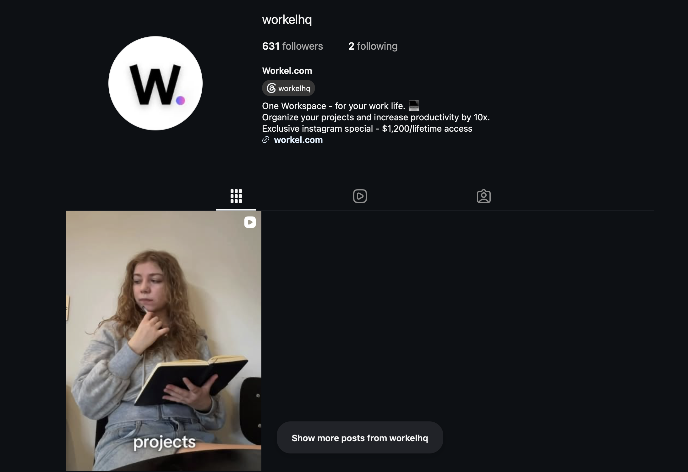
Exclusive stops meaning anything once it's not exclusive.
Their Instagram itself is barely maintained, which tells me the intent was there, but the follow-through wasn't.
That's the pattern across all of this: you either commit to a channel and build it properly, or you don't start it. Workel keeps starting things halfway.
AI, unlimited?
Workel claims it replaces ChatGPT Team, Notion AI, and one more internal tool, which they say adds up to over $45 a month in savings. At their price point, that math doesn't hold.
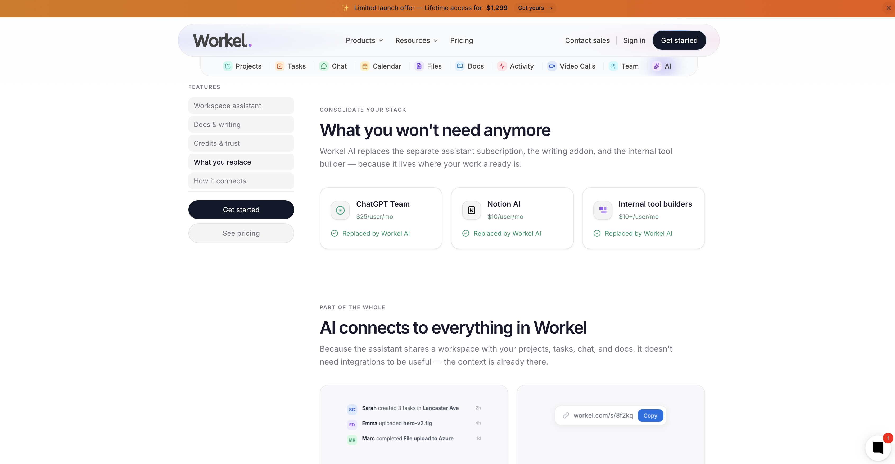
The AI feature is advertised heavily, but it's missing from the main pricing table. You only find out it's gated behind the Max plan and up once you open the full comparison table.
Setting that aside, what worries me is that hundreds of free-tier users on the yearly promo are about to hammer that AI feature for a full year with nothing to lose.
I tested it myself, inside the docs feature, and asked it to help write a blog post. It could only handle task creation and messages inside my own workspace.
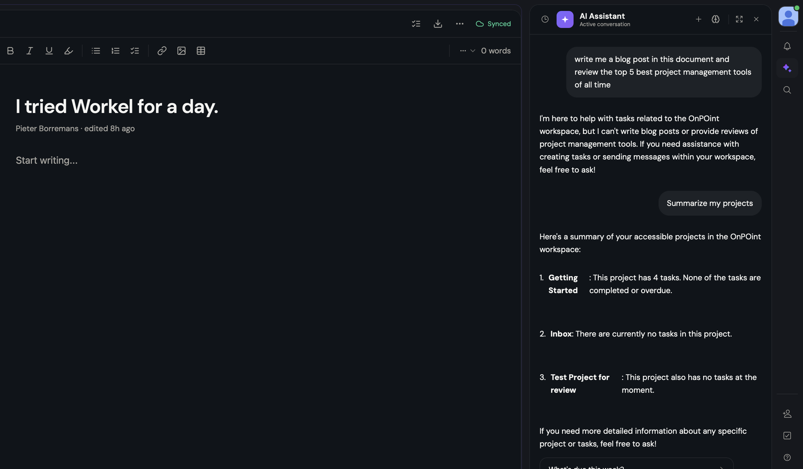
That's not close to what ChatGPT Team or Notion AI do. Both are more capable and more flexible than what I saw here. Unless they prove me wrong later, I'd call this another gap between what they're claiming and what they've built.
I think it's a hard sell
I can't make their approach add up. They're trying to do everything at once, and when you sprint in every direction, you get fucking burned. I've felt that myself, building my own things. Workel hasn't defined what makes it different yet, and it's leaning on free users to figure that out for them.
The inconsistencies are everywhere: the pricing, the constant context switching inside the product, the scattered channels. Getting a company to adopt a tool like this takes a strong, deliberate go-to-market.
Notion, ClickUp, and Monday earned that. Workel is copying the shape of what those companies do without doing the work underneath it.
Sometimes keeping tools separate, such as video calls here, chat there, docs somewhere else, reduces friction instead of adding to it.
Workel is chasing frictionless and an all-in-one workspace, and right now it's landing as the opposite of both.
I don't think this is a product I'll keep using past the free year. If they prove me wrong, I'll write that too.
Get new posts before anyone else
No noise, no automation sequences. Just what I'm writing, thinking about, and building, sent when there's something worth sending.
An email once in a while. Unsubscribe anytime.

Written by
Pieter Borremans
Writer·Content creator·Founder
Based in Taichung, Taiwan and London, UK, this is Pieter's personal journal and builder's blog: field notes on entrepreneurship, solo business-building, and the unfiltered reality of creating online. Alongside it, he's chasing one absurd goal in public, $168M USD in lifetime earnings, tracked live from zero.