
Single focus works: update #6
A week ago, I told myself I'd stop scattering my attention across five projects and give my flagship product 80 percent of my time. Real focus.
Looking back, I'm still a little impressed I survived the first stretch. I built the first real MVP with Claude AI, duct-taping a genuinely rough docs editor together entirely through GitHub's web editor.
That's the coding equivalent of assembling furniture with a butter knife. Eventually I graduated from toddler-coding to actually using Claude Code and Cursor, and that's when things stopped being a fight.
Read also: I build software like a toddler learning to walk
The moment I decided to single-focus, I wrote it down in a blog post, sat back, and made a list of what to tackle first. Six days later, today, August 1st, here's where I've landed and what's still coming.
The plan
My first instinct was to overhaul the app itself. I went the other way and started with the website instead. The reasoning was simple:
If I went deep on redesigning the site and its sub-pages, I'd probably discover what the app was missing, or what it had too much of.
I was right. A few critical, last-minute pivots came out of that process and are already in development.
The big realization was this: I can't let myself fall into the trap of bolting on some stupid features just to make the app look bigger. It's still a docs editor for creatives, bloggers, and small teams. It doesn't need to compete with Notion, Coda, or Capacities. I want it to stay exactly what it is.
For a while I flirted with the idea of AI features baked into the editor. I dropped it. A docs editor that isn't shouting "powered by AI" at you might be the better move when the entire market is flooded with red ocean products powered by AI.
Not everyone wants AI involved in their writing, or at least not inside the editor itself. If AI shows up at all, it'll be on the admin side, sorting or compiling docs faster, not sitting inside the writing experience. I'm still not sure that even makes sense yet.
The painful overhaul
Once I locked in on the core features, the goal was simple: extend the DNA of the app into the website, so the second you sign up or log in, it feels like the same place.
Sounded simple. It took roughly 25 miserable attempts to get the hero section right. I wanted it to represent the split-view feature, keep the same dark background as the app, and still feel playful.
That's a lot of contradictory instructions to hand yourself at once, let alone give it to Claude AI that understands your needs and desires. Those contradictions always turn into a session of frustration.
Read also: Claude AI Is both my greatest tool and my biggest frustration
After far too many iterations, I landed on it: a playful, straightforward hero with an exploded view and one strong, simple message.
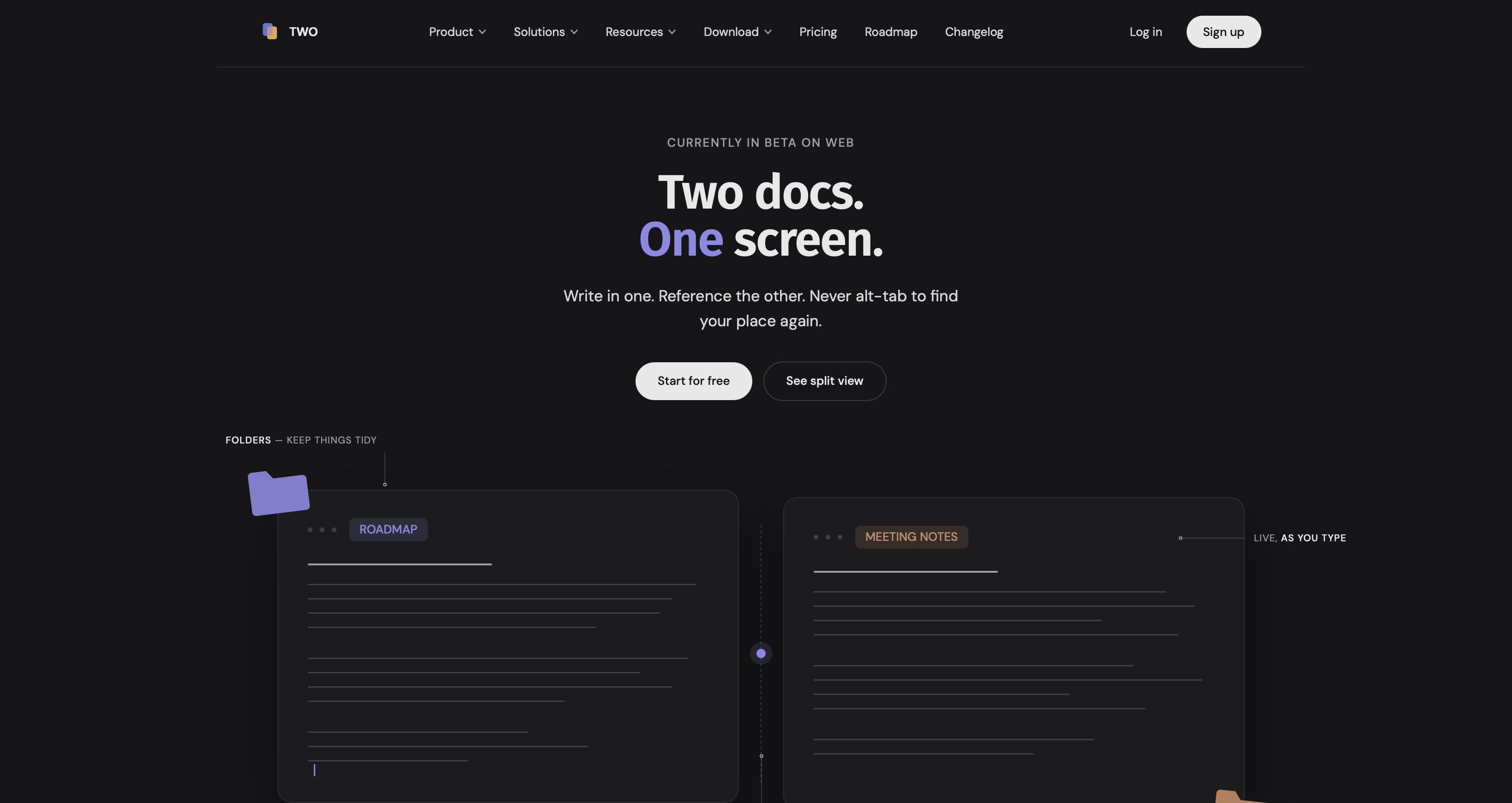
Everything after that moved faster. Every section, every page, was easier to design, but I still had to be careful with the copy and make sure the app was being represented accurately.
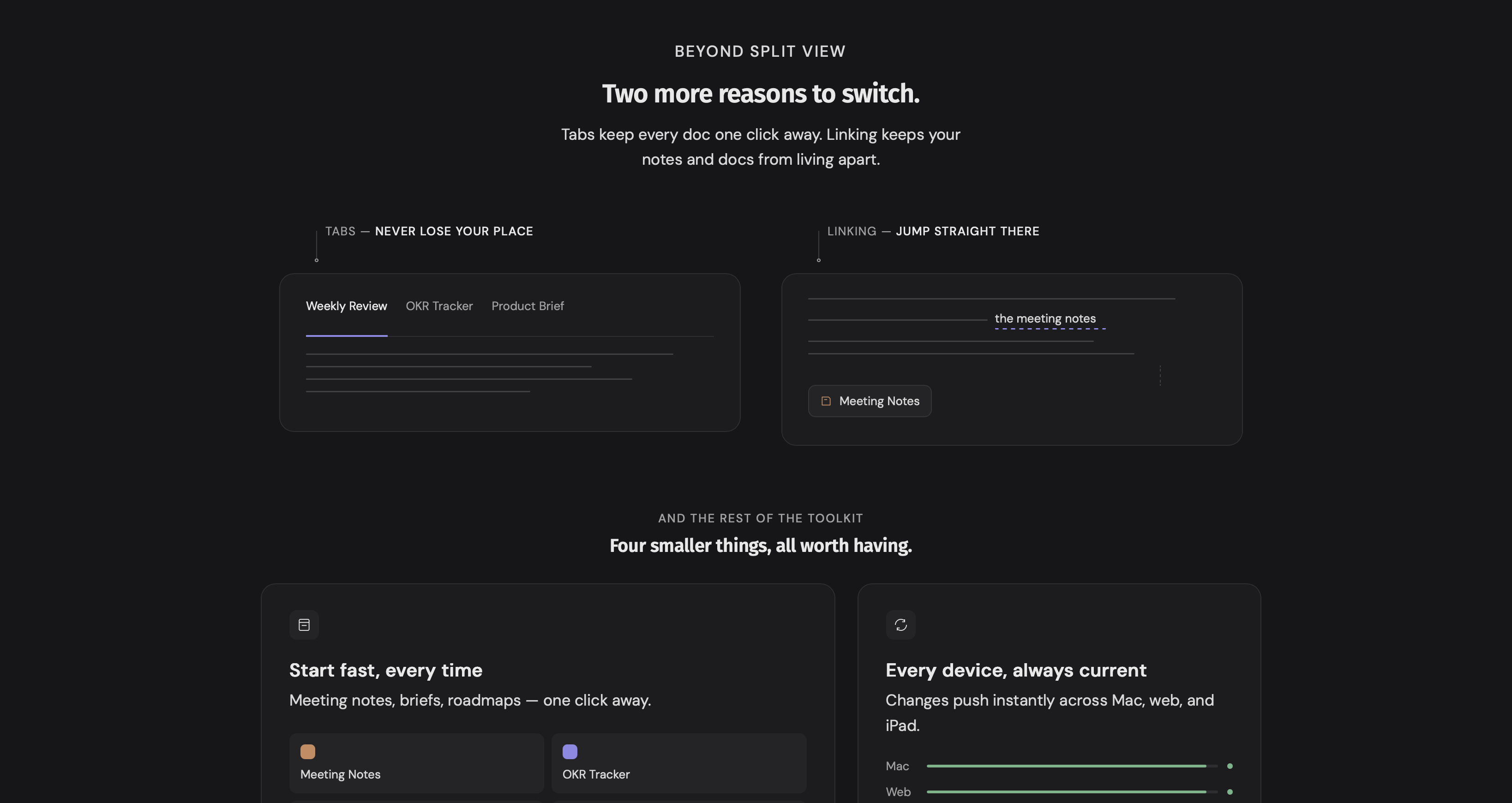
I put real time into the feature pages, giving each flagship feature its own page. From there, I carried the same tone and style into the solution pages for solos, teams, and creatives.
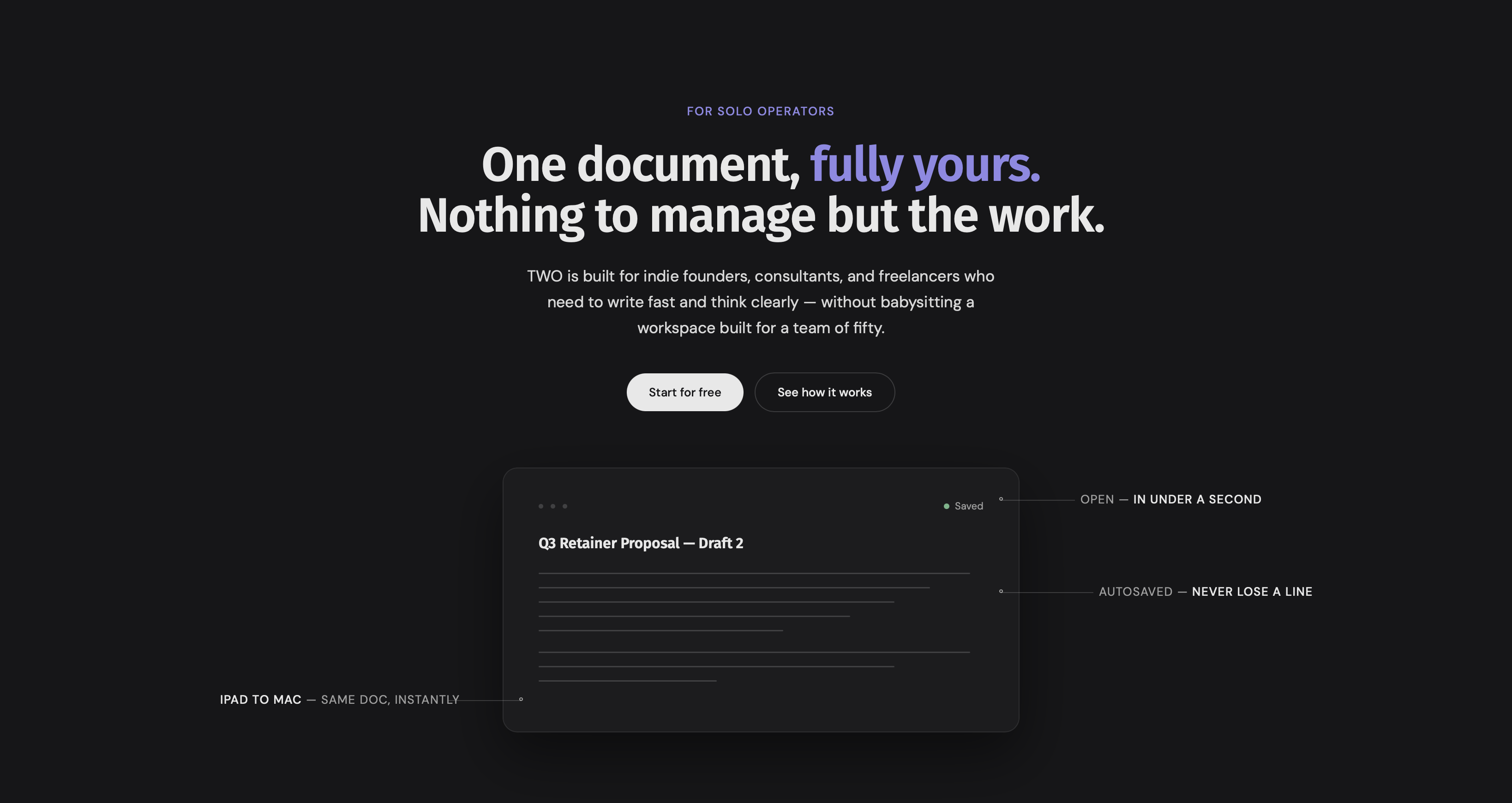
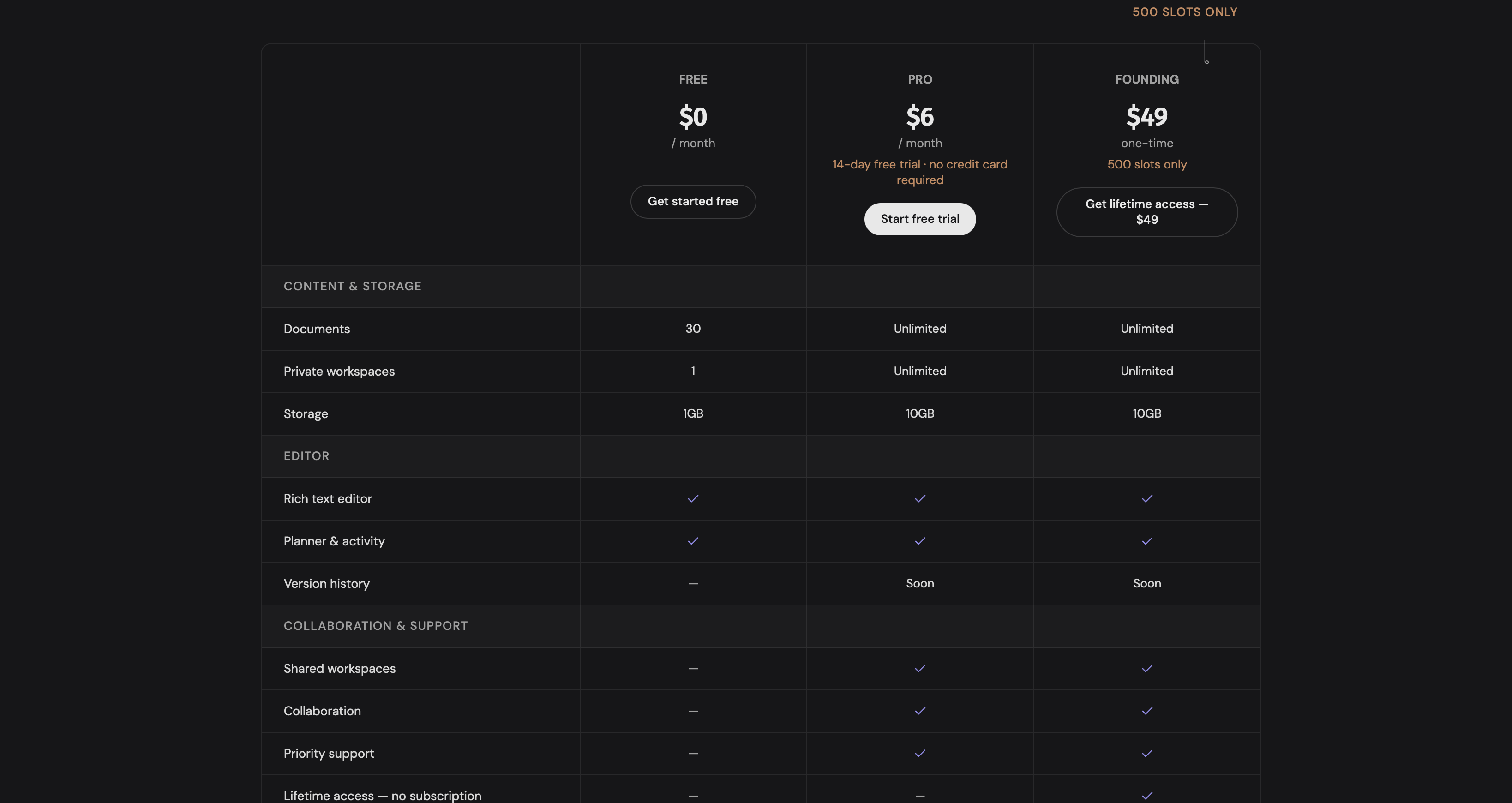
I capped it at three audiences on purpose. Any more than that and the product message gets diluted, and TWO Docs stops standing for anything specific. I also cleaned up the pricing page into a clear, simple table.
What went wrong
I leaned on Claude AI and my own input to iterate on design, and that came with a lot of yelling at Claude. It paid off, eventually. But somewhere along the way I noticed every design tweak was quietly adding a new font size.
When I finally did a sanity check and asked how many sizes we were using, the number was 14. On a simple site. It took a lot of back and forth, and a few insults I won't repeat here, to fix it. Even got to a point where Claude closed my conversation.
Six sizes is roughly the ceiling for something to stay readable. For reasons I still can't explain, Claude had added 0.5 pixels to one page and shaved it off another. Fixed now. Still so fucking stupid.
What's the focus now?
Three bottlenecks left on the website:
Adding more templates
Building a blog for SEO and organic search
Expanding the knowledge base so the site reads like a mature product, not a scrappy indie one
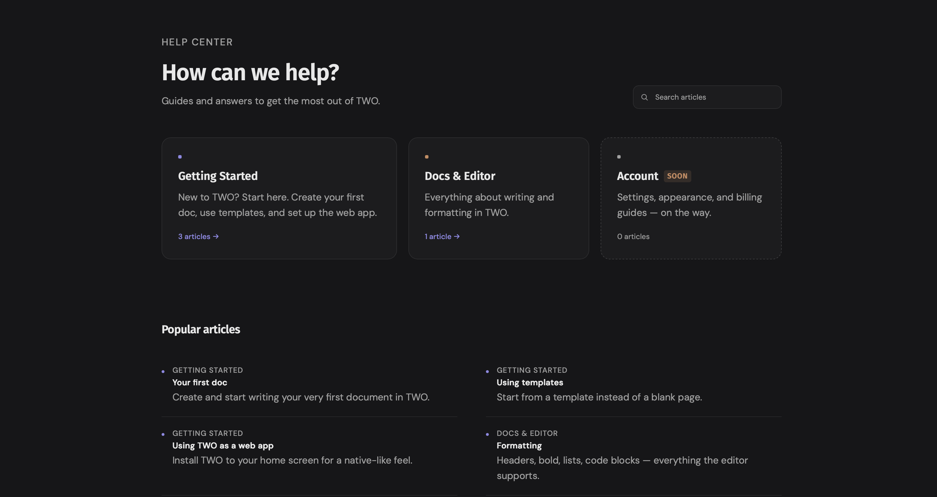
Templates and the knowledge base feel solvable; probably another focused week. The blog is the real burden. I already run multiple blogs, and the idea of adding one more to the pile makes me tired just typing this sentence.
And I think that's my mistake. I was so focused on building a niche blog network that I forgot to also add valuable blog content to real SaaS products, but I am going to see it through.
My track record with social media planning is, generously, a disaster. I have made peace with the fact that I will never be a person who batches content two weeks in advance in a color-coded calendar.
Read also: I need a social media content plan, and I suck at planning it
That person does not exist inside me. But I still think this blog is worth building, because organic search compounds in a way that scrambling for attention on social platforms never has for me.
I'm not in a hurry to make money from this. I'm not desperate to bolt on a new dumbass feature every week just to look busy.
There's a niche of people who want a simple, focused app without the fuss, and I'd rather build something well-maintained that needs very little babysitting than put my energy into distribution, organic marketing, and SEO.
The next update will cover the app changes and what the real DNA of this thing is going to be. For now, I'm just glad I picked one lane before trying to build five roads at once.
I'm genuinely fine with this taking years. Not in a forced, "trust the process" way; I mean it plainly: if it takes three years to get the first real customer base, that's the timeline.
I'd rather build something that's still standing and still mine in five years than chase a fast spike that fades the moment I stop feeding it. Slow and owned beats fast and rented, every time.
Get new posts before anyone else
No noise, no automation sequences. Just what I'm writing, thinking about, and building, sent when there's something worth sending.
An email once in a while. Unsubscribe anytime.

Written by
Pieter Borremans
Writer·Content creator·Founder
Based in Taichung, Taiwan and London, UK, this is Pieter's personal journal and builder's blog: field notes on entrepreneurship, solo business-building, and the unfiltered reality of creating online. Alongside it, he's chasing one absurd goal in public, $168M USD in lifetime earnings, tracked live from zero.